
Dashboard Overview
The Dashboard provides a wealth of information about the performance of your online store - all represented in easy to read charts that you can customise.
This article helps get you started.
Introduction
The Dashboard will be the first page you see each time you log into Aurora. It's the quickest way to analyse information and view trends over time on subjects such as revenue, orders and customer habits.
In this article, we'll give an overview of each section on the Dashboard, showing you how to view information that you can put to use.
Adjust Chart Detail
You can adjust the frequency of data points displayed on your charts using the menu to the top left of the page. This has the effect of increasing or decreasing the level of detail for all charts on the Dashboard. Whilst this is set to "DAY" by default, it gives you the option of also viewing data grouped by the hour, week or month.
You can also refresh the data used to populate the charts using the refresh button.

Would you like to see the dashboard refresh automatically?You can set an auto-refresh time period by clicking on the Report icon, to the top left of the Dashboard. For more information, see Dashboard Reports.
Core Metrics
Your stores headline statistics are summarised in the core metrics section. The core metrics section contains bite sized charts (sparklines) that summarise the trend in these values over time. They are accompanied by a headline value for that category.

The core metrics are:
- Orders: A sparkline that shows the volume of orders over time. This also displays the total number of orders received for the date range selected.
- Revenue: Displays total revenue for the date range selected. Shows how this trends over time.
- Average Order: Shows the average value of an order for the date range selected. Also displays this trend over time.
- Items Per Sale: Shows the average number of items purchased per order. Displays this trend over time.
- Discounts: Displays the amount of promotional discounts being applied to your customers orders over time. Also shows the total of all discounts applied in the time period selected.
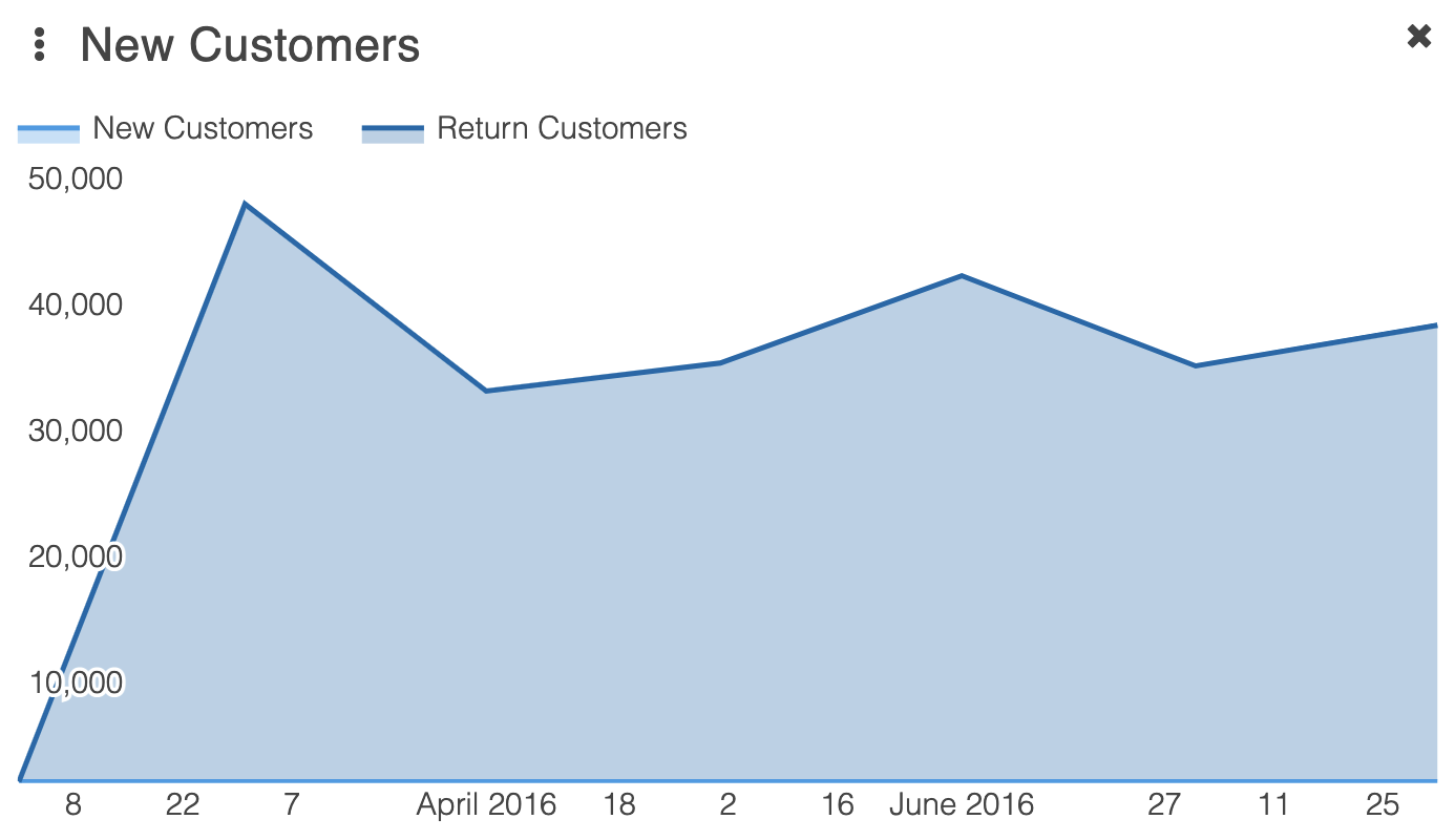
- New Customers: Indicates the volume of new customers over time. Also shows the total number of new customers during the date range selected.
Want to change the date range or make a comparison?The next article discusses both date ranges and comparisons in detail.
Any of the core metrics can be selected to produce a larger, more detailed chart.

Want to know the exact value for any point on the chart?You can hover your cursor over any point on the chart that you would like more information on - a box will appear providing the data value(s).
The New Customers field will often show as "0" when viewed on a test site. Correct values will be displayed on your live site.The New Customers field uses the volume of unique email address to calculate how many new customers have placed orders. Customer data is sanitised on test instances of Aurora - part of this process involves removing customer email addresses. This, in turn, often results in the New Customers field displaying as 0 on test sites.
Widgets
Unlike the Core Metrics, widgets are not based on live real-time activity and it is just a snapshot of the moment. Please see specifics of each widget below.
Below the core metrics, are a selection of widgets. Each widget contains a detailed chart on a specific subject, allowing for easy comparisons. Widgets range from a breakdown of order statuses over a selected period, to a world map displaying the countries from which sales have been received.
If you refer to some widgets more often than others, you can create a custom layout for the Dashboard by moving those widgets higher up the page. You can do this by clicking and dragging the title bar of the widget to the desired location. Your layout will be saved between logins.
The core metrics section can't be moved, therefore widgets will always display immediately below the core metrics section.
Available Widgets
Widget | Description |
|---|---|
Payment Method Breakdown | A pie chart that shows the proportions of different payment methods used. |
Order Status | A pie chart that breaks down the order statuses for the selected period of time. This is just a snapshot of the moment the order was placed and is not set to ever check if they changed thereafter. Therefore if refunds/returns take place, it would not register on the Dashboard. Dependent on how an order is configured, will determine how this displays. |
Desktop Orders vs Mobile Orders | A bar chart that allows comparison between the volume of sales from desktop and mobile platforms over a period of time. |
New Customers vs Existing Customers | A bar chart that allows comparison between volumes of sales from new and existing customers. |
Country of Sale | A world map indicating the country from which orders over the selected period of time were made. |
Latest Activity | Includes details on the latest orders, bestselling items, recent customers, recent reviews, outstanding questions and recent coupon attempts. This just shows a snapshot of the days activity and cannot be compared on the dashboard to previous days. |
Don't use certain widgets?You can minimise widgets you don't use by selecting the "X".
Minimised widgets can be found at the bottom left of the page. To re open a minimised widget, drag the label back onto the Dashboard.
Updated 4 months ago