
Custom Page Builder Widgets & Objects
This article describes how to create your own content Widgets & Objects for use in the Page Builder.
Introduction
If you are looking to provide and more tailored (or 'guided') experience for your content editors/managers, Aurora provides features to allow you to control what content can be managed via the Page Builder and how.
This includes hiding certain features from your users and even creating your own content Widgets & Objects to use.
Read on below to find out more!
What can you do?
Using this feature, you are able to create your very own selection of Widgets & Objects for your users to drag, drop and configure in your content.
This allows you to provide advanced layouts to all content managers, irrespective of their HTML and Editorial ability.
Furthermore, you can even declare what each of your Widgets can be used for, affecting whihc pages they will appear on, e.g. Products & Snippets or only Blogs? It's your choice!
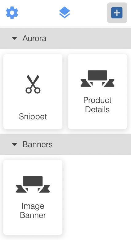
Please see the following example of the customised Page Builder UI provided as an example by the Aurora Demo store.
Creating your first custom Widget/Object
Finding the Page Builder Widgets/Objects
You manage the Page Builder Widgets/Objects using Smarty Templates in your Front-end Template location(s). Simple upload new files to the following location and see the new items appear in all of Aurora's Page Builders instantly:
/templates/<YOUR_TEMPLATE_DIR>/page_builder/template_blocks
In the Aurora Demo Templates, this is found here:
/templates/example.com/page_builder/template_blocks
These examples are the best way to get started, so download the most recent files from the Aurora Demo Example Templates.
Here one example file for you to see and start experimenting with:
{setPageBuilderBlockProperties title="Image Banner" category="Banners" supportedContentTypes="product-categories" iconSvg='<svg fill="#000000" height="50px" width="50px" version="1.1" id="Capa_1" xmlns="http://www.w3.org/2000/svg" xmlns:xlink="http://www.w3.org/1999/xlink" viewBox="0 0 297 297" xml:space="preserve"><g id="SVGRepo_bgCarrier" stroke-width="0"></g><g id="SVGRepo_tracerCarrier" stroke-linecap="round" stroke-linejoin="round"></g><g id="SVGRepo_iconCarrier"> <g> <polygon points="79.801,180.101 106.091,211.171 106.091,180.101 "></polygon> <polygon points="190.909,180.101 190.909,211.171 217.199,180.101 "></polygon> <path d="M202.577,220.604h86.907c2.864,0,5.478-1.754,6.743-4.322c1.265-2.569,0.96-5.76-0.787-8.03l-17.721-22.996l17.539-20.981 c1.867-2.241,2.268-5.214,1.031-7.855c-1.237-2.641-3.89-4.039-6.806-4.039h-40.796v5.348c0,4.912-1.31,9.527-4.014,13.055 C234.754,183.726,202.577,220.604,202.577,220.604z"></path> <path d="M52.329,170.782c-2.987-3.755-4.599-8.576-4.599-13.63v-4.77H7.516c-2.916,0-5.569,1.398-6.806,4.039 c-1.237,2.641-0.835,5.614,1.031,7.855l17.539,20.981L1.56,208.252c-1.746,2.27-2.051,5.461-0.787,8.03 c1.265,2.569,3.88,4.322,6.743,4.322h86.906C94.423,220.604,62.481,183.542,52.329,170.782z"></path> <path d="M64.64,162.185c1.403,1.678,3.682,2.916,5.895,2.916h156.241c1.79,0,3.922-1.039,5.12-2.368 c1.148-1.275,1.792-3.403,1.792-5.003V84.346c0-4.151-3.654-7.95-7.805-7.95H70.535c-4.151,0-7.805,3.22-7.805,7.371v73.384 C62.73,158.918,63.52,160.845,64.64,162.185z"></path> </g> </g></svg>'}
{addPageBuilderBlockParameter label="Image (URL)" variableName="bannerImageUrl"}
{addPageBuilderBlockParameter label="Link (URL)" variableName="bannerLinkUrl" type="text"}
{addPageBuilderBlockParameter label="Banner Width" variableName="bannerWidth" type="select" options="'Width: Full':100,'Width: Half':50,'Width: Quarter':25"}

<div class="page-builder-image-banner">
  <a href="{$bannerLinkUrl}"><img src="{$bannerImageUrl}" width="{$bannerWidth}%;" /></a>
</div>This example creates a very simple image banner for use in product category content only, that can be clicked to load another page on your store.
The next example demonstrates how to use 'optional' parameters and even perform logical template decisions on the parameter's values.
{setPageBuilderBlockProperties title="Paramiter Logic Example" category="Examples" iconSvg='<svg fill="#000000" height="50px" width="50px" version="1.1" id="Capa_1" xmlns="http://www.w3.org/2000/svg" xmlns:xlink="http://www.w3.org/1999/xlink" viewBox="0 0 297 297" xml:space="preserve"><g id="SVGRepo_bgCarrier" stroke-width="0"></g><g id="SVGRepo_tracerCarrier" stroke-linecap="round" stroke-linejoin="round"></g><g id="SVGRepo_iconCarrier"> <g> <polygon points="79.801,180.101 106.091,211.171 106.091,180.101 "></polygon> <polygon points="190.909,180.101 190.909,211.171 217.199,180.101 "></polygon> <path d="M202.577,220.604h86.907c2.864,0,5.478-1.754,6.743-4.322c1.265-2.569,0.96-5.76-0.787-8.03l-17.721-22.996l17.539-20.981 c1.867-2.241,2.268-5.214,1.031-7.855c-1.237-2.641-3.89-4.039-6.806-4.039h-40.796v5.348c0,4.912-1.31,9.527-4.014,13.055 C234.754,183.726,202.577,220.604,202.577,220.604z"></path> <path d="M52.329,170.782c-2.987-3.755-4.599-8.576-4.599-13.63v-4.77H7.516c-2.916,0-5.569,1.398-6.806,4.039 c-1.237,2.641-0.835,5.614,1.031,7.855l17.539,20.981L1.56,208.252c-1.746,2.27-2.051,5.461-0.787,8.03 c1.265,2.569,3.88,4.322,6.743,4.322h86.906C94.423,220.604,62.481,183.542,52.329,170.782z"></path> <path d="M64.64,162.185c1.403,1.678,3.682,2.916,5.895,2.916h156.241c1.79,0,3.922-1.039,5.12-2.368 c1.148-1.275,1.792-3.403,1.792-5.003V84.346c0-4.151-3.654-7.95-7.805-7.95H70.535c-4.151,0-7.805,3.22-7.805,7.371v73.384 C62.73,158.918,63.52,160.845,64.64,162.185z"></path> </g> </g></svg>'}
{addPageBuilderBlockParameter label="Optional Value" variableName="optionalValue" type="text"}
{addPageBuilderBlockParameter label="Logical Value" variableName="logicalValue" type="select" options="'On':'on','Off':'off'"}

<div class="page-builder-rich-test">
    -{$logicalValue}/{$optionalValue}-<br />
    {if "{$logicalValue}" == "on"}
    Setting is ON<br />
    {else}
    Setting is OFF<br />
    {/if}
    {if "{$optionalValue}"}
    Optional Value is set to "{$optionalValue}".<br />
    {/if}
</div>
Configuring your Widget/Object
It is possible to configure a range of things for a Widget. You should do this using the following two methods:
- setPageBuilderBlockProperties - This configures the way the Widget/Object appears in the Page Builder.
- addPageBuilderBlockParameter - This allows you to add and then configure parameters for your Widget/Object for the use to configure.
Using setPageBuilderBlockProperties
This configures the way the Widget/Object appears in the Page Builder and accepts the following parameters.
Parameter Name | Type | Validation | Notes |
|---|---|---|---|
title | String |
| This will default to the filename of the block. |
category | String |
| This will set the group in the Page Builder UI under which this Widget/Object will appear. This defaults to “Aurora” if not set. |
supportedContentTypes | Pipe Delimited String | One or more of:
| If not provided (or blank), the Widget will appear in all Page Builders across Aurora. |
iconSvg | String | None, however speachmarkes (“) will automatically be escaped. | Aurora will use a default icon if one is not provided. |
All parameters are completely optional.
Using addPageBuilderBlockParameter
This configures the way the Widget/Object appears in the Page Builder and accepts the following parameters.
Parameter Name | Type | Validation | Notes |
|---|---|---|---|
label | String |
| This sets the label/name that will be displayed for this Widget/Object in the Page Builder UI. |
variableName | String | My only contain:
| All parameters are made available to you in your Template file. This sets the name of the variable that will be made available to you containing the value configured by the user. |
type | String | Must be “text” or “select”. If it is not one of these two, then “text” will be transparently used instead. | This tells Aurora what type of input you want this to accept. |
options | String | This will be validated by attempting to decode the string as JSON. If a parameter fails validation, then the parameter will not be rendered to the PB UI and instead and error will be output to the UI in its place. | This is only used when type is set to 'select' and controls what options should be presented in the list of options. Please see the following valid example: 'Width: Full':100,'Width: Half':50,'Width: Quarter':25 |
All parameters are completely optional.
If this method is not called at all, then no custom parameters will be displayed in the UI.
Layout components with droppable areas
With droppable areas it is possible to create layout components that have areas that can accept child components via drag and drop.
The following table shows the attributes that are used to configure the drop areas:
Name/Value | Type | Description | Example |
|---|---|---|---|
|
| Marks the element a drop area. |
|
|
| Restricts the drop area to only accept a single child component. If the drop area is already populated, dropping another component onto this drop area will remove the existing child component. Optional. If omitted the drop area will accept an unlimited number of components. |
|
|
| Sets a custom name for the drop area. This can be used to describe the purpose of the drop are which can be helpful when editing content pages. Optional. If omitted the drop area will be named "Droppable Area" |
|
Example layout component with droppable areas
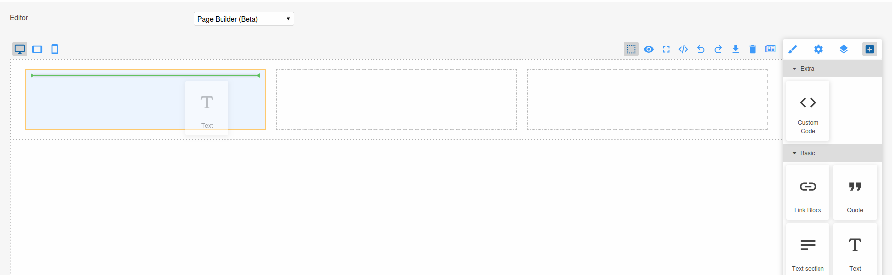
The following example shows a component layout with 3 separate droppable areas.
Each droppable area has a custom name.
The second droppable area is restricted to accept only a single child component.
{setPageBuilderBlockProperties title="Three Columns" category="Layouts" iconSvg='<svg fill="#000000" height="50px" width="50px" viewBox="0 0 24 24" xmlns="http://www.w3.org/2000/svg"><path d="M4 3h16c1.11 0 2 .89 2 2v14c0 1.11-.89 2-2 2H4c-1.11 0-2-.89-2-2V5c0-1.11.89-2 2-2m0 2v6h16V5H4m0 8v6h5v-6H4m7 0v6h9v-6h-9z"/></svg>'}

<div class="three-column-layout" style="display: flex; justify-content: space-between; padding: 20px;">
  <div class="pbro-droppable-area column" data-custom-name="Column 1" style="flex: 1; margin: 0 10px; min-height: 100px;">
  </div>
  <div class="pbro-droppable-area column" data-custom-name="Column 2" data-droppable-single-child="true" style="flex: 1; margin: 0 10px; min-height: 100px;">
  </div>
  <div class="pbro-droppable-area column" data-custom-name="Column 3" style="flex: 1; margin: 0 10px; min-height: 100px;">
  </div>
</div>
This will appear as follows when added to the Page Builder. This screenshot also shows a Text component being dragged onto one of the droppable areas:
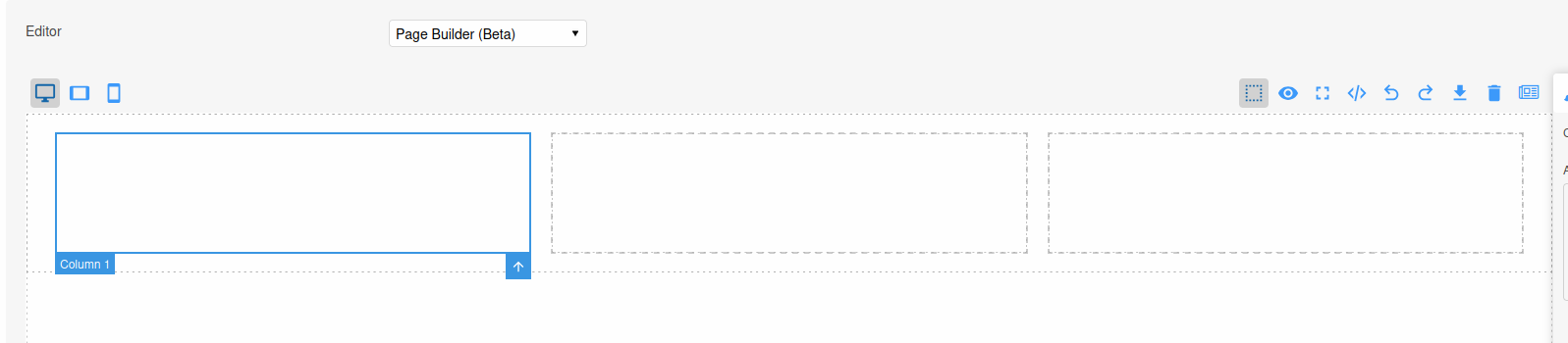
The following screenshot shows the custom Droppable Area Name in action:
Viewing Errors and Notices
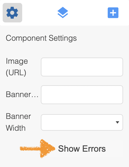
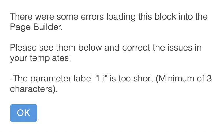
It is very common to run into problems when configuring your Widgets and so it is important to understand how to find out more information when things go wrong.
In the event that Aurora is unable to render some aspect of your Widget, it will include ad much detail as it can in the Widgets configuration panel.
Please see the following example and notice the "Show Errors" link that can be clicked in order to expose a dialogue that contains the details required. In the example the label given to one of the Widget's parameters is too short:
Updated 3 months ago