
Creating & Maintaining Menus
This article covers adding and managing Aurora Menus via the Aurora Back-end.
Creating & Maintaining Menus
What you need to do
Before creating a menu, you should first plan what you want the menu to contain. Doing this in advance can save a lot of time later and ensure the menu you produce is as simple and quick to manage as it can be going forward.
A well built menu can manage itself, if configured correctly. Please consider the following steps carefully with this in mind.
To help with this process, the following should be considered:
- Can the options desired be generated dynamically (from categories, fields, etc)?
- Are there options that will appear in multiple menus, e.g. "Shop by Brands", "Shop by Price", etc? If so, these should use facets.
Step-by-step
1. Create a Menu
Create a new menu using the Menu Manager by clicking the "Add Menu" button and providing a unique name for the menu.
This name will be used to retrieve the menu later from display on the Front-end.
2. Create the Facets
Decide what Facets will be needed and create them to be used by your menus (This can be done after creating your menus and added in later, but it is best to consider them from the start).
3. Set-up the Menu Settings
Set what properties you would like the menu to have, setting how its options will be generated and if it will use the Facet(s) created in step 2.
4. Set-up the Menu Children
Once that Menu Facets and Dynamic sources have been configured, the Menu is ready for customisation. Apply any custom setting needed and then the menu is ready for templating.
Menu Manager User Interface (UI)
The Basics
Figure 1 shows the basic Menu Manager User Interface (UI). This particular example shows that there are two menus in the system, "Testing Sidebar Menu" and "Main Menu".
These two menus are completely separate and it is these names (i.e. "Testing Sidebar Menu" and "Main Menu") that should be used when fetching them for use by the Menu Manager Templates.

Figure 1: Basic Menu Manager UI
Labelled in red in Figure 1 are all of the elements of the Menu Manager UI. Each of these items are briefly described below.
- Add New Menu: This button adds new menus to the Menu Manager.
- View & Update Cache: This button shows the Menu Cache UI, allowing you to clear the cache being used by the Front-end.
- Edit Menu: This button edits the top-level Menu's settings and in Figure 1 sets that the "Testing Sidebar Menu" should be generated from the "Brand" field, among many other things described later in this document.
- Add Item: This button adds a new menu item to the menu. Items added in this way are considered static by the system and so will always be present and customisable. Please see the "My Custom Menu" item in the "Testing Sidebar Menu" which was added in this way. All other items are simply pulled from the "Brand" field.
- Delete: This button removes the Menu from Aurora completely.
While there is a confirmation process on this action, once performed, there is no way to retrieve the menu or any of its settings and so if required, this would need to be re-created from scratch.
- Menu Item Actions: This bar allows you to perform all of the operations described in items 3 - 5, but for one specific Menu Item. The default action is "Edit" and clicking this will allow you to configure the Menu Item's properties and children (if children for the item should be automatically generated from some other source).
Also included are the "Add Item" and "Delete" actions, which allow you to add Custom sub-menu items or remove the option altogether.
When selecting the "Add Item" action from this location, the item added will be placed into that sub-menu and not into the parent, e.g. selecting the "Add Item" action on the "Apple" item in Figure 1, would mean that a new child is added inside the "Apple" menu and not top-level menu.
- Enable/Disable: This can be a Green Tick or a Red Cross and allows you to Enable and Disable Menu Items as needed:
- Green Tick: Means the item is currently enabled and clicking this will disable it.
- Red Cross: Means the item is currently disabled and clicking this will enable it.
- By clicking on any Menu Item, the item will be 'opened' and its children will be displayed for editing.
If a Menu Item has no children, then clicking here will do nothing.
Menu Icons
In Figure 1, the items listed can be seen with different icons to the left of each item. This icon represents (loosely speaking) where the Menu item was generated from.
This is done to allow you to tell if the item was created manually, or perhaps generated by the system from some other data source or Facet.
The following key describes each icon and what it usually means:
- Static or Custom Items - something that was created manually or has had some manual settings applied to it. This can be any item added, or perhaps a previously dynamic item that was edited, to provide some kind of customisation.
These items or their customisations can always be deleted using the "Delete" action. - Dynamic Items - something that is generated from a data-source in Aurora, i.e. something that was not manually created or edited. These cannot be removed, only disabled from view in the menu in question.
- Dynamic Facet Items - something that is generated dynamically from a Facet and applied to the current Menu. This cannot be removed, only disabled from view in the menu in question.
List Dividers
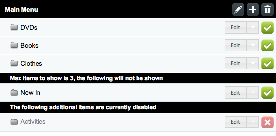
Figure 2: Menu Manager List Separators
You will occasionally see black separators in your list of Menu Items, as shown in Figure 2 (e.g. "The following additional items are currently disabled" and "Max items to show is 3...").
These separate active items that will appear in your final menu from other items that will not. The items below the divider are the ones that will be hidden from the Front-end and the reason for this is described in each individual separator.
Below is a short list of the dividers you might expect to see and a brief description of what they mean (these are subject to change):
- Max items to show is X, the following items will not be shown: This message means that the list of items is limited to a particular number of items (e.g. X might be 3) and there are more than this in the current list. As a result, the items that fall outside this limit will not be shown on the Front-end.
To increase this limit, 'Edit' the settings of the Parent Menu Item, changing the "Max items to show" setting as desired.
In Figure 2, you would need to use the "Main Menu" edit icon (item 3 in Figure 1) to change this limit.
- The following additional items are currently disabled: This message means that the items below the divider have been disabled completely and so will not be shown on the Front-end.
You can enable them again by clicking the Enable/Disable icon (item 7 in Figure 1).
Setting up a Menu or Facet
The entire Menu Manager runs off the settings configured in the Menu Manager Settings area.
Once a Menu, Facet or Menu Item has been created, it can be edited by clicking either of the 'Edit' buttons, depending on which you wish to edit, as labelled in Figure 1 (items 3 and 6).

The above is an example of the settings used to generate the "Main Menu" seen in all our current examples.
Updated 4 months ago